CSS Grid
Grid is a 2D layout in CSS, where we can use rows and columns. So for a 2D layout Grid is better than flexbox.
We use the fr unit to show how much fraction of the grid one individual row or columns take.
As HTML by default goes row-wise, we generally define layout column wise.
.container{
    grid-template-columns: repeat(3, 1fr);
}
The above CSS creates a grid with 3 columns.
Now inside a grid we can make elements take more than 1 row or 1 column using the grid-rows and grid-columns
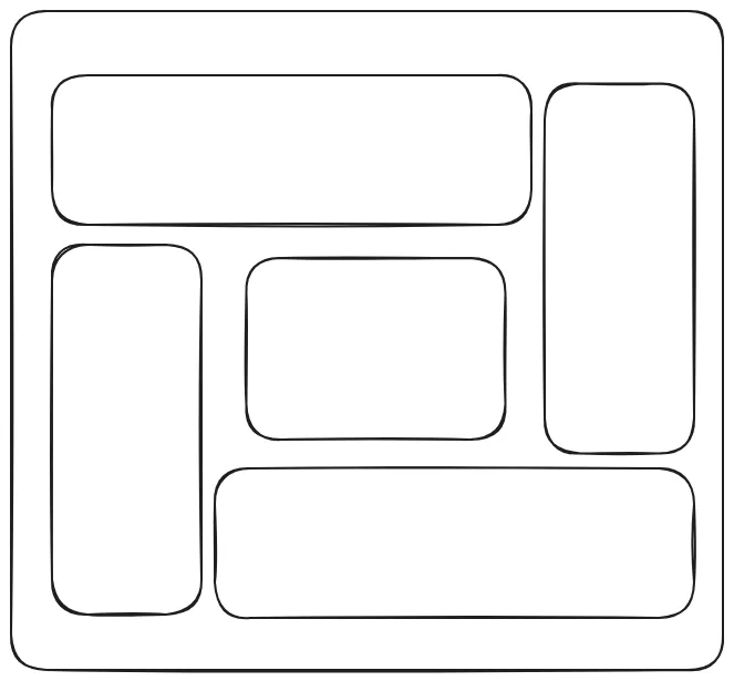
Let’s have a look at how we can implement the following layout in CSS -
<!DOCTYPE html>
<html lang="en">
<head>
    <meta charset="UTF-8">
    <meta name="viewport" content="width=device-width, initial-scale=1.0">
    <title>Document</title>
    <style>
        .container{
            display: grid;
            /* A 3 column grid layout */
            grid-template-columns: repeat(3, 1fr);
            gap: 20px; /* create a gap between grid items */

        }

        .box{
            /* Basic layouts */
            min-width: 200px;
            min-height: 200px;
            border: 4px solid black;
            border-radius: 10px;
            font-size: 50px;
            padding: 20px;
        }


        .box1, .box5{
            grid-column: span 2; /* here we are making box1 and box5 span 2 columns */
        }
        .box2, .box3{
            grid-row: span 2; /* here we are making box2 and box3 span 2 rows */
        }

    </style>
</head>
<body>
    <div class="container">
        <div class="box box1">A</div>
        <div class="box box2">B</div>
        <div class="box box3">C</div>
        <div class="box box4">D</div>
        <div class="box box5">E</div>
    </div>
</body>
</html>
Now the layout we achieved with the span we can also do with the grid line numbers. Here is a repersentation of line numbers in grid -
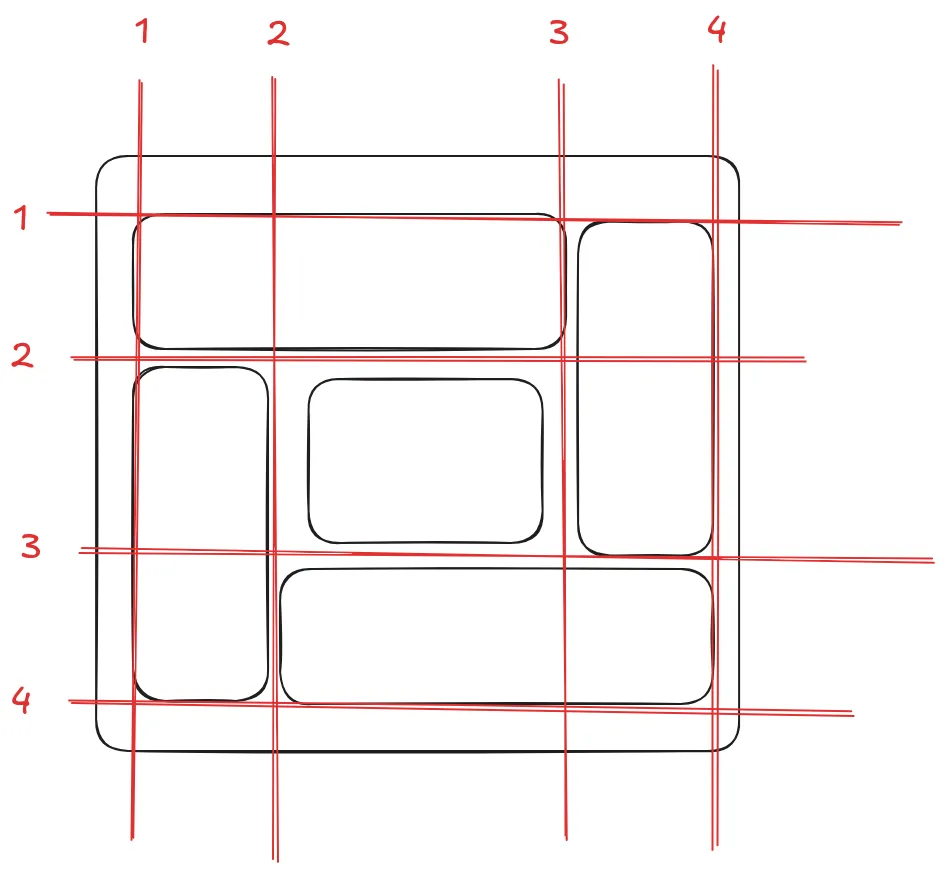
Now with the line numbers we can set the columns start and end or row start and row end using /
.box1{
    grid-column: 1/3;

    /*
    grid-column-start: 1;
    grid-column-end: 3;
    */

    /* both are the same thing*/
}