CSS Flexbox
CSS Flexbox is a 1 dimensional layout which can lay items row-wise or column wise.
To display items as flex we can use the following css property in the parent element -
div{
    display: flex;
}
By default flexbox is displayed as a row but we can change it to column based view as well -
div{
    display: flex;
    flex-direction: column;
}
Now in flex, if we have all the margins and paddings reset we will see all the elements in flex sticking to each other. We can use margins to create the gaps, but we can also use the gap property for more predictable gapping between flex items -
div{
    display: flex;
    gap: 10px;
}
Now we have two main properties in flex alignment. justify-content aligns items to center, left or right according to vertical axis and align-items do the same for horizontal axis (given our flex is in row direction, for columns this will be reversed).
There are these following values to justify-content -
- flex-start - Default value.
- flex-end - Items are positioned at the end of the container. For a row based flexbox this will place all the items in the right hand side
- center - Items are positioned in the center of the container.
- space-between - Items will have space between them resulting in even gaps between all the items and first and last items reaching the ends of the container.
- space-around - Items will have space before, between, and after them.
- space-evenly - Items will have equal space around them.
There are these following values to align-items -
- stretch - Items are stretched to fit the container
- center - Items are positioned at the center of the container
- flex-start - Items are positioned at the beginning of the container
- flex-end - Items are positioned at the end of the container
We can also give weightage/more space to flex items with the flex property -
.container{
    display: flex;
    gap: 10px;
}
.box{
    flex-grow: 1; /* Makes flex items take the available space */
    /*add border to make items visible*/
    border: 2px solid black;
    padding: 10px;
}
.box2{
    flex: 2; /*This Gives more space to the box 2*/
}<div class="container">
<div class="box box1">
a
</div>
<div class="box box2">
b
</div>
</div>Now, let’s have a look at implementing a layout with Flexbox -
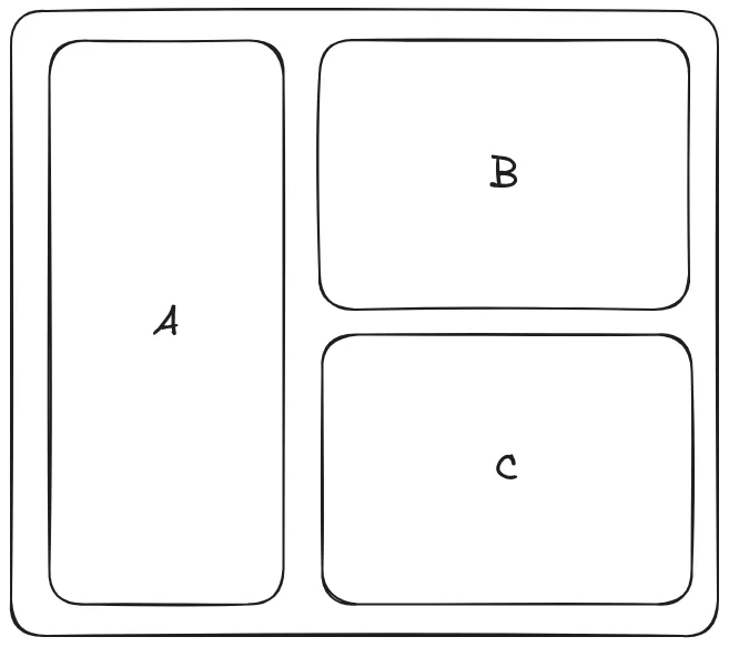
So to implement this layout the Code is -
<!DOCTYPE html>
<html lang="en">
<head>
    <meta charset="UTF-8">
    <meta name="viewport" content="width=device-width, initial-scale=1.0">
    <title>Document</title>
    <style>
        *{
            margin: 0;
            padding: 0;
            box-sizing: border-box;
        }

        body{
            display: flex;
            justify-content: center;
            align-items: center;
            min-height: 100vh;
        }

        .container{
            padding: 30px;
            /* border: 2px solid black; */
            display: flex;
            gap: 30px;
            background-color: antiquewhite;
            width: fit-content;
            margin: 0 auto;
        }

        .box{
            min-width: 200px;
            min-height: 200px;
            /* border: 2px solid black; */
            font-size: 50px;
            border-radius: 10px;
        }

        .box .box{
            border: 2px solid black;
        }

        .box:first-child{
            background: #abcacb;
        }

        .box2 .box:first-child{
            margin-bottom: 30px;
        }


    </style>
</head>
<body>
    <div class="container">
        <div class="box">A</div>
        <div class="box box2">
            <div class="box box1">B</div>
            <div class="box box3">C</div>
        </div>
    </div>
</body>
</html>